
Manifesto
Everybody starts somewhere.
Every lawyer. Every dentist. Every engineer.
From the people who save lives every day,
To the ones who are teaching the next generation.
Every expert was once a beginner.
Every pro was once an amateur.
And that’s why every step after high school, is a step towards your future career.
At BigFuture, we know that charting your next path first means picking a path.
And when there are so many options to choose from, it’s important that you have the right
information so you can make the right decision for you.
That’s why we have a wealth of resources to help you get started.
From choosing a career to prepping for admission tests, to planning for and paying for college—we got you covered.
Your future is right ahead, ready for the taking—
You, the future fashion designer.
You, the future director.
You, the future change maker.
Remember, we all have to start somewhere—so let's get out there and get started today.
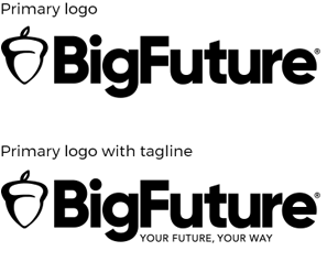
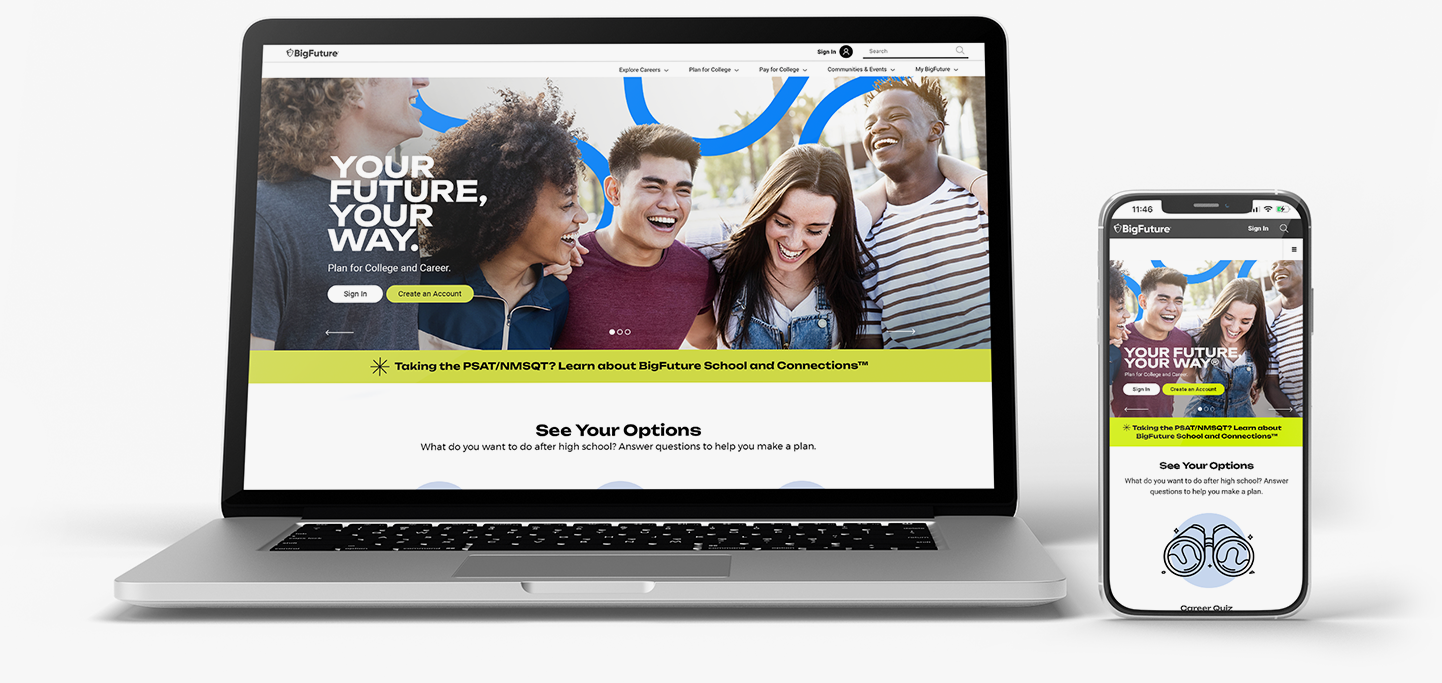
BigFuture
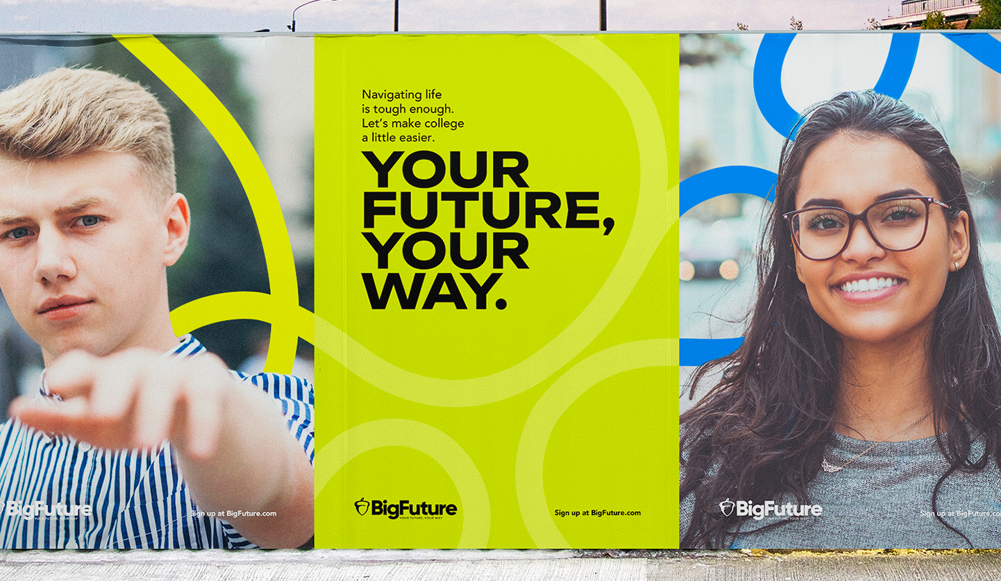
Your Future, Your Way
Logo Synopsis
The new visual identity for BigFuture is an updated look and feel that has a modern sensibility, while still feeling inherently human and invites conversation. The typeface chosen communicates trust and respect but also an agility and approachability. The acorn gives a subtle nod to the relationship with CollegeBoard, which is equity we want to tap into, but still allows BigFuture to craft its own unique space.
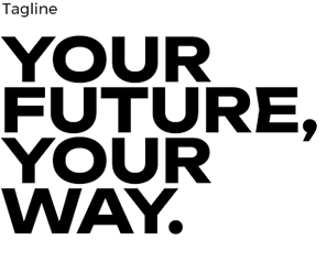
Tagline
The tagline “Your Future, Your Way” reinforces the idea that BigFuture exists to help its core student audience fulfill their individual potential. It strikes a fine balance between the brand being a much needed guide and advocate, but at the same time, empowering students to use the tools and resources that BigFuture provides to make the best decisions for them.
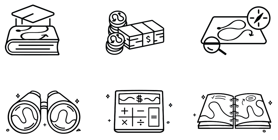
Design Elements
The design elements chosen to build our language focus on a future with unlimited potential using symbols like the circular loop element to imply connected knowledge, the path element to touch on the many paths our students could be taking, and stars to reinforce the idea of dreaming and imagination. Together with other elements like photography and color they create a multi layered design language.

Logo Synopsis
The brand iconography is meant to be modern, striking, minimal and direct. We use iconography to reinforce a point, as texture in our design language and as cues to the information.
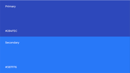
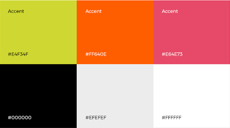
Color Palette
The brand color palette takes subtle cues from and builds on the existing BigFuture colors. Wae keep neutrals of black, white and grey in place and use our accents to bring energy, vibrancy and sophistication to the overall design language.
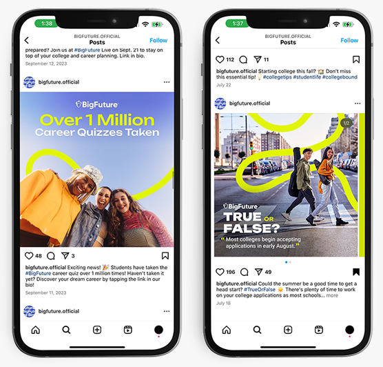
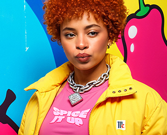
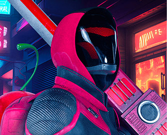
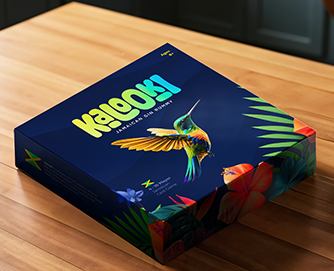
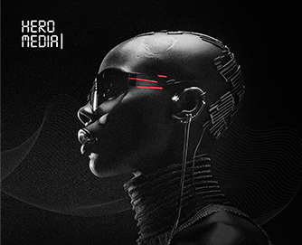
FEATURED PROJECTS
The creative approach is anything but ordinary. It brings fresh, exciting perspectives that elevate every project.